
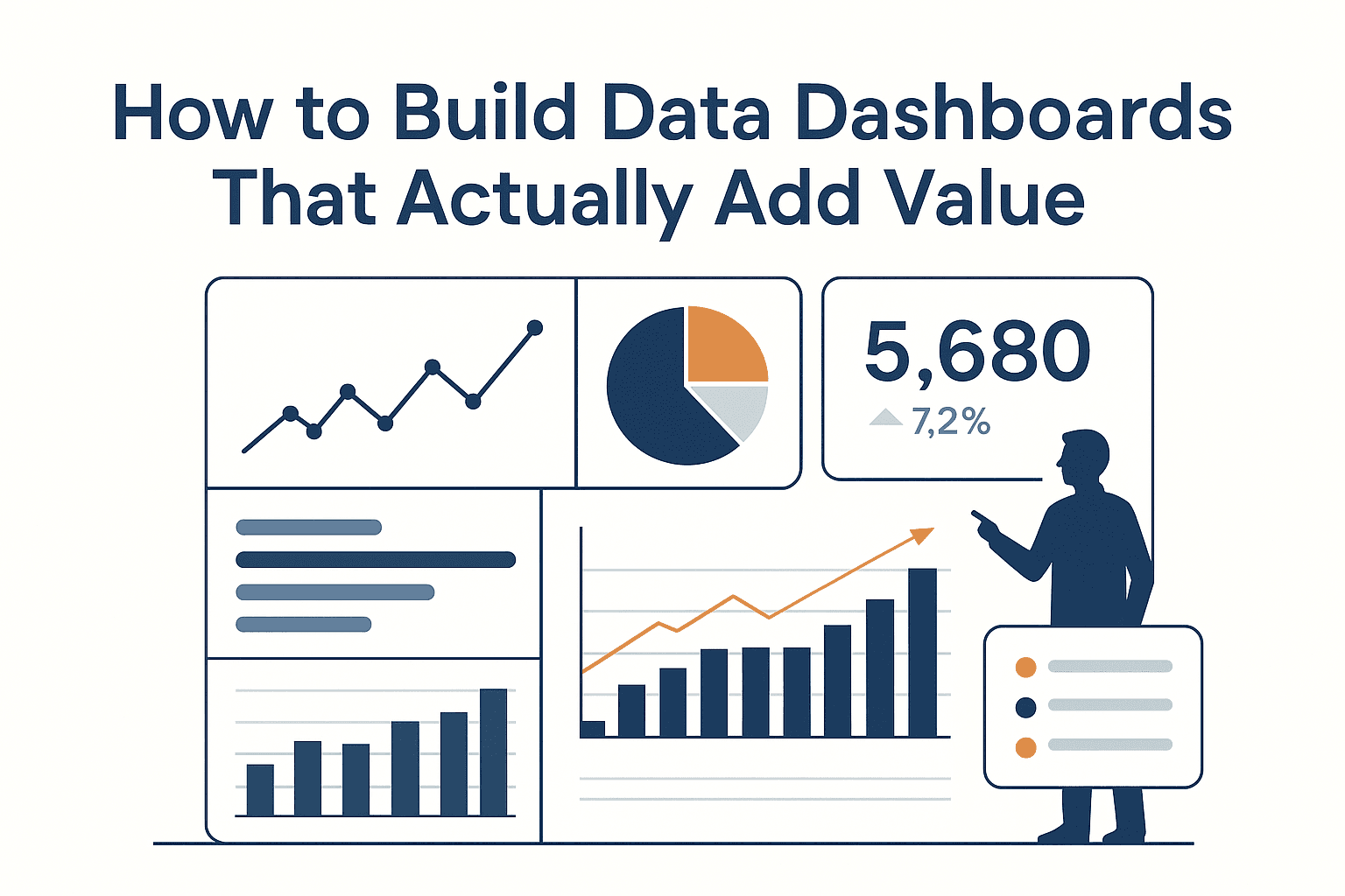
Most dashboards are corporate wallpaper — shiny, colorful, and completely useless for data-driven decision making. If dashboards don’t guide someone to an action within seconds, they aren’t dashboards… they’re screensavers.
Here’s how to build actionable dashboards, the kind that executives trust, teams rely on, and analysts brag about.
1. Start With a Purpose (Real Dashboards Serve a Decision)
Dashboards don’t fail because of design.
They fail because no one asked the first, most important question:
“What decision should this dashboard help someone make?”
A great dashboard clarifies:
- whether performance is on track,
- where a bottleneck is forming,
- which KPI needs attention today,
- and what action should come next.
If the dashboard can’t answer a single business decision in 10 seconds, it’s not a dashboard — it’s a data dump with colors.
2. Know Your Audience (Executives ≠ Teams)
This is where 80% of dashboards go wrong.
When people try to create a “one-size-fits-all” dashboard, they accidentally create one-size-fits-none.
Executives prefer simplicity — think 5–7 KPIs, clear colors, and fast signals. They don’t want details; they want direction.
Teams, however, live in the details. They need trends, operational insights, and clear breakdowns. Analysts? They want the whole kitchen, including the ingredients list.
A dashboard that respects audience differences will always outperform one that tries to be everything to everyone.
3. Show Movement, Not Just Numbers
A static number is meaningless without context.
A rising or falling trend, though? That’s decision intelligence.
Highlight:
- changes over time,
- anomalies,
- sudden spikes,
- drop-offs,
- deviations from targets.
Businesses act on movement — not isolated metrics. Your dashboard should tell users where the momentum is… and where it’s slipping.
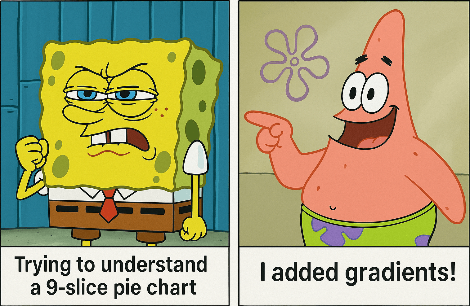
4. Keep the Visuals Simple (Good Dashboards Are Not Art Projects)
Let’s say it plainly:
Nobody ever made a better decision because a chart had gradients.
Clean visuals win:
- line charts for trends
- bar charts for comparisons
- tables for exceptions
- donut charts… sparingly (control yourself)
Avoid chart junk like 3D effects, rainbow palettes, or overly creative layouts. Simplicity is not basic — simplicity is effective.
Consistent color rules (green = good, red = bad, yellow = warning) help the brain process information faster than any image or fancy effect ever will.
5. Make KPIs Talk Like Humans — Not Databases
A dashboard should not require explanation.
Bad heading:
“Revenue – Q1”
Better (and actually useful):
“Revenue down 7.8% — Conversion drop in North region.”
This is data storytelling: telling users what changed, why it matters, and what needs attention.
The more human the insights, the faster decisions happen.
6. Automate the “Aha!” Moments
Dashboards shouldn’t wait for you to open them.
They should notify you when something important happens.
Smart dashboards should:
- flag anomalies,
- highlight high-risk segments,
- detect unusual patterns,
- trigger alerts when KPIs cross thresholds,
- and suggest actions (even basic ones).
This is where Zenthos shines — we build dashboards that don’t just visualize data… they interpret it.
7. Speed, Reliability, and Trust Are Non-Negotiable
Even the best-designed dashboard collapses if:
- it loads slowly,
- the numbers aren’t fresh,
- filters break,
- or metrics contradict other data sources.
Users trust dashboards only when they trust the data behind them.
Without trust, adoption dies — and so does the dashboard’s value.
At Zenthos, we follow a simple rule:
If it’s slow, fix it. If it’s confusing, simplify it. If it’s wrong, remove it.
Final Thought: Dashboards Should Reduce Thinking, Not Increase It
The true test of an effective analytics or KPI dashboard isn’t how it looks — it’s how quickly someone can make a decision after seeing it.
If your dashboard:
- highlights what changed,
- guides attention,
- exposes risks,
- and reduces mental load…
…then congratulations — you’ve built something powerful.
If not? It’s time to rethink it.
Want Dashboards People Actually Use?
The kind leadership trusts, teams rely on, and clients appreciate?
👉 Talk to Zenthos to transform your dashboards.
We build dashboards that turn data chaos into clarity — and clarity into action.